How to actually test frontend
Pragmatic testing strategies used by leading engineering teams.
By Chromatic Editorial
Senior technical staff
Who we researched for this guide


Why test frontend?
Frontend testing is unwieldy. Users expect frequent releases packed with features. But new features introduce more complexity that you then have to test.
While a solid test suite is more vital than ever, it’s tricky to pick the right tool. Everything promises “easy, not flaky, fast” and has gotchas in the fine print.
This guide showcases frontend testing techniques used by scaled engineering teams. That way, you can create a pragmatic testing strategy that balances ease, maintenance, and coverage. We’ll also point out pitfalls to avoid.
Who is this for
This guide is made for teams with revenue-generating apps because the compounding benefits to velocity and safety are worth maintaining a test suite. Skip this guide if you’re a small team without product-market fit. Instead focus on manual testing first while you ideate on product.
Why should you trust us?
We researched dozens of teams: OpenAI, Twilio, Adobe, MongoDB, Shopify, Microsoft, and more. This included reviewing open source code then combing through CI setups and live interviews. We build Storybook which is used by half of the Fortune 50. Its global adoption gives us broad exposure to best and worst practices.
What to test
In modern frontend development, we work with components and data fetching. Thus we can break down frontend testing into these fundamental concepts:
- Logic: Is the underlying frontend logic correct?
- Render and behavior: Does the component render and react to user interaction?
- Accessibility: Is the frontend usable with screen readers & keyboard-only navigation?
- Appearance: does a component look right given a set of props or state?
- User flows: Can users complete critical workflows across multiple pages?
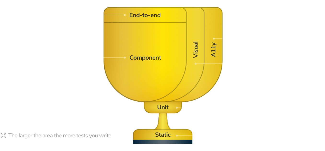
Each concept corresponds to a different type of test. No test type provides coverage to all concepts, each one has a unique superpower that none of the others have. To catch bugs across your entire frontend, you need to mix your tests. The Frontend Testing Trophy below is a handy overview of test types covered in the guide.

Unit tests: Is the frontend logic correct?
Frontend logic code is often independent of the UI. It’s written as pure functions which are then imported into a component. These functions take data as input and return data as output without any side effects. While these are complex functions with multiple logic branches, testing them is straightforward with tools like Vitest or Jest.
Both Vitest & Jest provide a test runner, an API for writing tests and assertions, and utilities for mocking functions, modules, and timers. Unit tests run in a CLI/CI within a Node.js environment, which makes them the fastest running and easiest to write test type.
However unit tests are used less frequently in frontend development because a majority of our code is intended for the web browser. The rule of thumb “Write tests. Not too many. Mostly integration” still holds true.
Are unit tests worth it?
Sometimes. Unit tests require minimal effort to write and maintain. Since frontend code often targets the browser, unit tests play a much smaller role than in other disciplines like backend engineering. Watch out for overdoing unit tests by trying to cover every detail of your frontend.
Component tests: Does UI render & respond to interactions
Tools: Storybook, Testing Library
Component tests bridge the gap between unit and end-to-end tests. They allow you to test individual components in isolation, including logic, browser rendering, and interactions, without the overhead of setting up a full application environment.
As a frontend developer, you spend most of your time building components. Everything from a button to a page is a component. These components render HTML and CSS but have lots of different variations depending on the combination of inputs and state passed in.
Squint, and you’ll notice that components resemble logic functions described in the unit tests section above. Components are functions that take data as input and output UI.
Historically, testing rendered output has been a painful process. Most testing tools were designed to run in CLI/CI within a Node.js environment. The tests would return a blob of HTML as a string, requiring complex assertions to verify its structure. Unsurprisingly, most developers ended up not testing frontend because debugging was so onerous.
Component tests offer an alternative approach where components are rendered in an actual browser where you can verify the output visually and assert behavior interactively. In tools like Storybook, you create a stories file to describe the component you’re testing. Then, you write stories to showcase different variations of the component, such as error conditions, empty states, and default states. These stories act as test cases.

Assert interactive behavior
Components are dynamic. Users can interact with the UI, fill out form fields, and trigger events. Typically, components have internal logic that responds to these events and updates the rendered appearance accordingly.
With Storybook, you simulate user behavior (click, type) then write assertions for how the component is expected to respond.
Since component tests run in a real browser environment, you can interactively debug them using standard browser devtools. Inspect the DOM, play around with styles, and use the debugger to step through the code.
Are component tests worth it?
Always. Component tests are low maintenance, executed in real browsers, and have no flake because they’re isolated from other parts of the stack. You get the specificity and speed of unit tests with the user-centricity of E2E tests.
Accessibility tests: does the frontend work for all users?
Tools: aXe
Your users interact with the UI in diverse ways. For example, with a mouse, touch screen, keyboard and screen reader. Accessibility is the practice of making websites usable to all people.
The most accurate way to test accessibility is to manually check it across a combination of browsers, devices, and screen readers. But it’s also the most time-consuming. That’s why teams use a hybrid approach that combines manual testing and automation.
First, use a machine to catch obvious accessibility violations. Use Axe library to audit rendered DOM against a set of best-practice heuristics - similar to a linter.
Then, write component tests to query the UI just as a user would. Query elements by their aria-roles and use user-event to simulate user interactions.
Finally, manually spot check accessibility across various browsers, devices, and screen readers.
Combining automated and manual ends up being a pragmatic balance of coverage and effort. You get a fast feedback loop where you can find and fix accessibility issues before they hit production. Most teams use Axe to run automated checks on components. This also allows them to perform targeted testing to uncover bugs faster. For example:
- Atomic components: evaluate keyboard awareness, poor color contrast or missing aria attributes.
- Compositions: verify that composed components don’t impede each other’s behavior.
- Pages: ensure that all the headings and various sections appear in the correct tab order.
Are accessibility tests worth it?
Often. Using Axe doesn’t automatically make your app accessible, but it does catch many issues early so you can concentrate your manual efforts on the areas that matter. Since 2025, accessibility requirements have tightened across Europe, and legal pressure continues to grow across North America and Europe.
Visual tests: Does the component look right?
Tools: Chromatic
Modern interfaces have countless variations. The more you have, the tougher it is to confirm that they all look right in users’ devices and browsers.
Visual tests verify the appearance of every state in your frontend. They’re the perfect complement to Component and E2E tests.

With Component tests, you have a TDD-style approach to verify a component’s rendered output and behavior. However it still requires you, a human, to look at the pixels to confirm design intent. Repeating this manual process for every variation on each commit is mind-numbing.
With E2E tests, you spin up a full app to verify the rendered UI and user flow. This still requires you to navigate to each page, and look at the pixels to confirm design intent. Doing this by hand for every page in your user flow is tedious.
Visual tests capture a screenshot of every component or page — complete with markup, styling, and other assets — in a consistent browser environment. You manually review UI appearance just once to accept it as a baseline. For all subsequent commits, a machine automatically takes new screenshots and compares them to your previously accepted baselines to find changes.
When changes to frontend appearance are found, visual tests notify you to accept them as new baselines or fix them as bugs.
Are visual tests worth it?
Always. Visual tests protect frontend appearance from degrading over time. This results in enormous time savings because you’re not manually checking every frontend variation in every browser and viewport. What’s more, you don’t have to write or maintain separate visual test files because this test type piggybacks on your existing Component and E2E tests.
End-to-End (E2E) tests: Verify core user flows
Tools: Playwright, Cypress
Even the most basic tasks require your users to complete a sequence of steps across multiple pages. End-to-end tests verify that each of these steps works by spinning up the entire app including backend, APIs, and frontend then simulating how a user navigates. This allows you to identify integration failure points.
While E2E tests are closest to production, there are trade-offs. Testing the complete application requires substantial infrastructure work. You have to create a test environment that deploys all parts of your system in tandem—frontend, backend, and other services. Seed test data. And then connect to a cloud browser to actually run the tests. All of this is maintenance overhead.
What’s more, the E2E setup step alone can take longer than running all other test types combined.
Every team we interviewed was cautious about over-investing in E2E tests. Instead, opting for component tests which run faster and need less maintenance. But for some teams, the trade-off is worth it. O’Reilly uses Docker to spin up their entire infrastructure. And then runs E2E tests using Cypress to verify user journeys.
When to run E2E tests
E2E tests are a form of “black box” testing, which means tests are run after your app code is built & bundled. We often see E2E tests run in CI as a “finishing” step to check that critical user flows work correctly.
Is it worth it?
In moderation. E2E tests have significant trade-offs: high confidence for high effort. Therefore, limit E2E tests to just the critical user flows, e.g., sign up → add to cart → buy.
Static analysis: Check for type errors & code formatting
Static analysis tools compare code to a fixed set of rules or best practices to find issues. They serve as in-development sidekicks to help you avoid obvious mistakes before your tests even run. Your team customizes which rules to check and the static analysis tools ensures everyone complies.
Is static analysis worth it?
Static analysis scans code before it hits the browser, it ultimately plays a supporting role for frontend testing which is intended to run in browser. We still recommend static analysis because it gives you confidence that test code itself meets your organization’s standards.
When to test
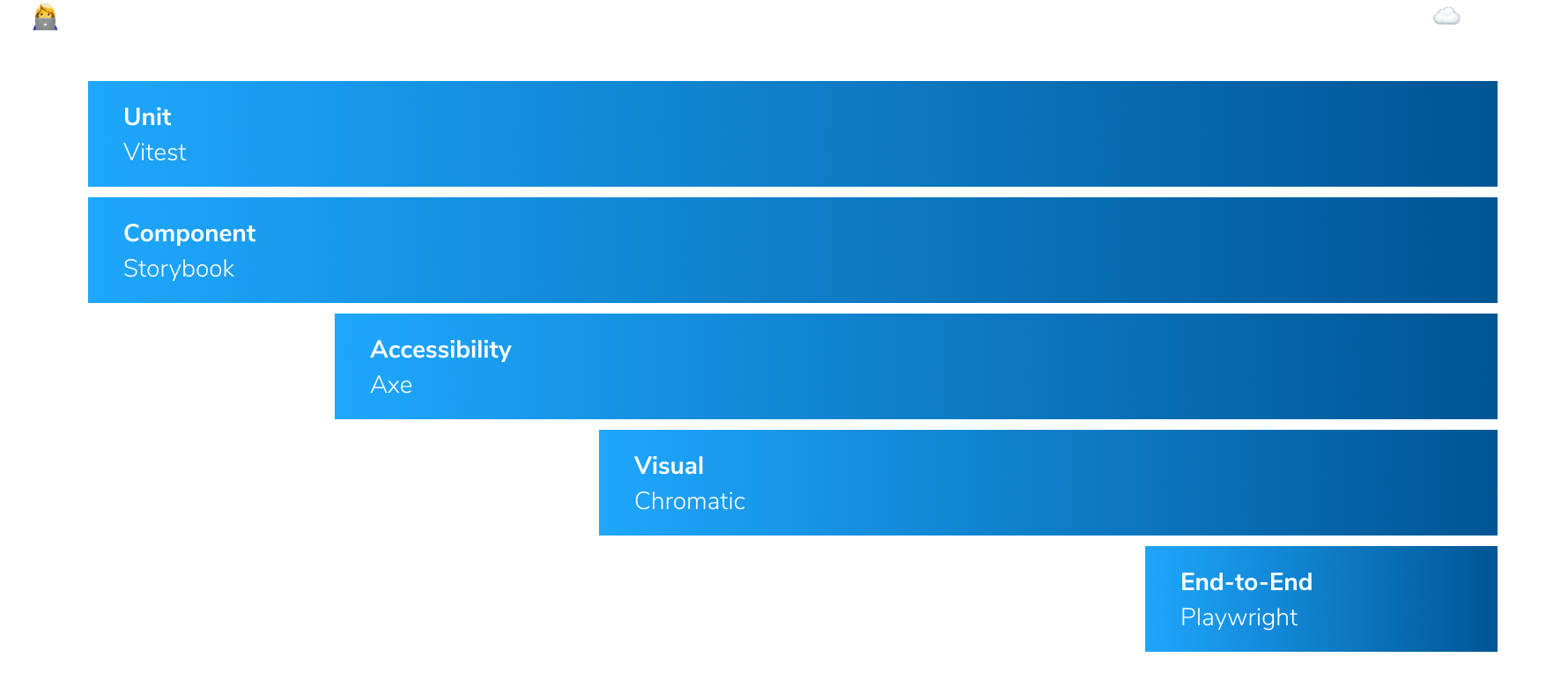
So far we covered five unique frontend testing types. While it’s tempting to consider all of them at once, developers can only fix one bug at a time. The order you run tests matters.

A developer’s core job is to meet the functional requirements of a feature. Unit and component tests give you confidence that you’re meeting product requirements and provide the fastest feedback. Run these tests first.
Once you confirm that the frontend renders in a browser and behaves as intended, you can move onto making it accessible. This can involve replacing functional code or altering behavior, so it’s helpful to rely on your existing unit & component tests as a backstop.
Now that you’re confident in the implementation, it’s time to confirm that the pixels match the design. This often requires multiple cycles of tweaking. Your visual tests ensure you don’t break the appearance of other parts of the app accidentally.
Everything you’ve done so far expressed the breadth of your app. Now you must confirm that frontend integrates with the rest of the app. Use end-to-end tests as a “finishing” step to verify the core user flows work correctly.
Use Continuous Integration to automate every test
Tests are most useful when run continuously. Integrate tests with your Continuous Integration (CI) pipeline to automatically trigger your testing suite every code push. The results are reported in the pull request for everyone to review. Make each test type a “required check” in your Git provider to enforce quality for the whole team.
Where should you focus?
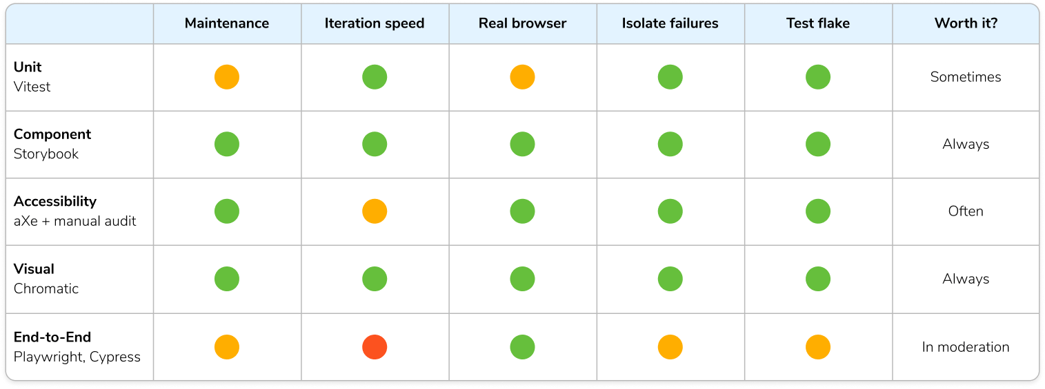
We created this guide because frontend testing isn’t one-size-fits-all. Only you can choose a testing strategy for your needs. The table below summarizes each frontend testing method’s pros and cons and how often it’s typically used.
- 💰 Maintenance cost: time and effort required to write and maintain the tests.
- ⏱️ Iteration speed: time between making a change and seeing test results.
- 🖼 Realistic environment: where the tests are executed—in a real browser or a simulated Node.js environment like JSDOM.
- 🔍 Isolate failures: a test fails, how quickly can you identify the source of the failure.
- 🤒 Test flake: false positives/negatives defeat the purpose of testing.


